 |
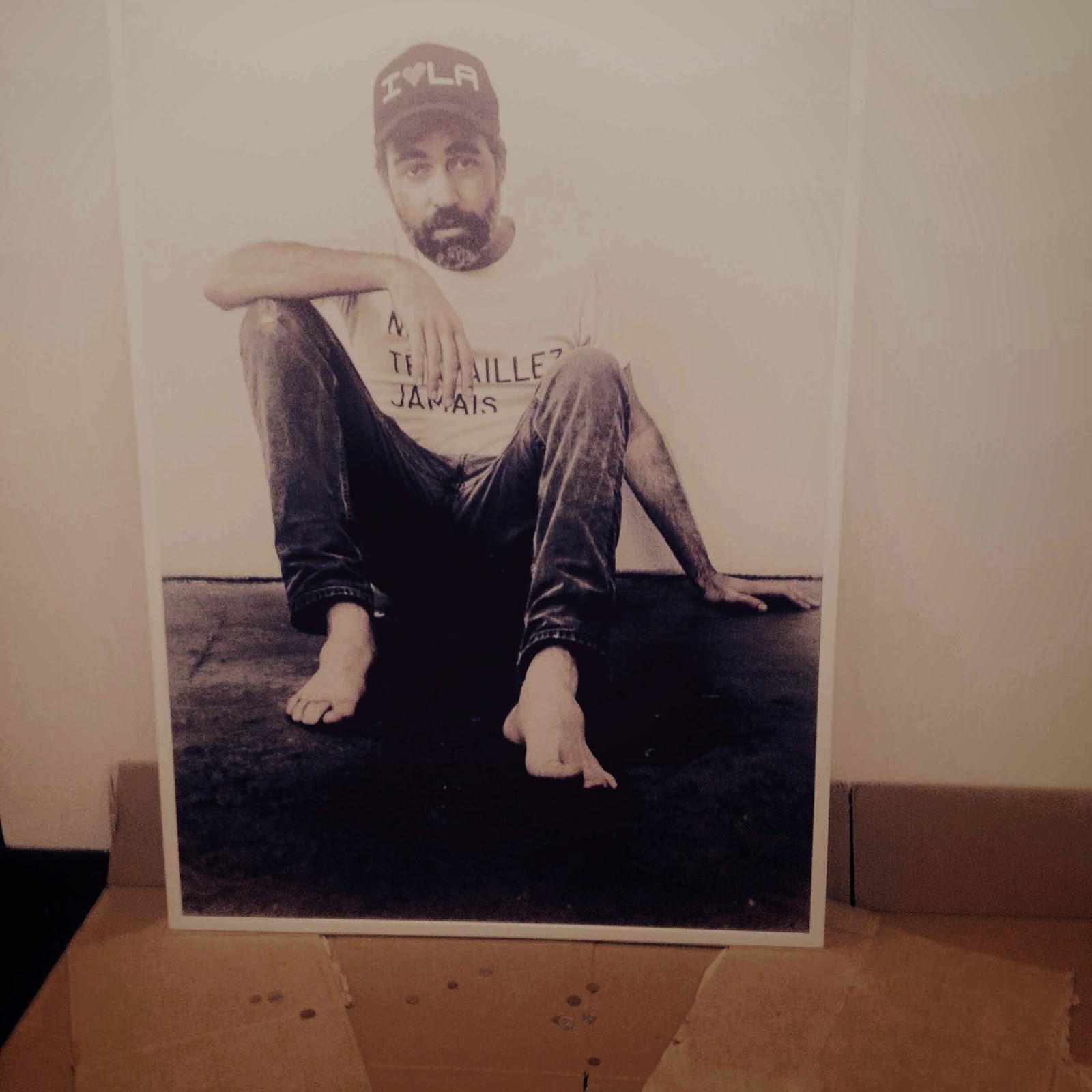
| Spare change anyone? (not the title) Ed Young's work at the Smac stand at the Cape Town Art Fair. pic by Mary Corrigall |
As such perhaps we should simply celebrate this abundance; attending these fairs shouldn’t be about assessing the objects or even weighing in on each exposition’s ideological framing but embracing this seductive socio-political “moment”, viewing it as a stage in our cultural development where quantity is not only a characteristic but the overriding element worthy of our attention. It’s not about how our artists, designers and the organisers of these fairs are presenting culture, or even what they might or might not be communicating, but that they are communicating, they have the means and the voice.
This, unfortunately, would be a naive and overly romanticised if not blinkered view or at least is only one side of this phenomenon. Surely, our cultural awakening is at a more developed stage, where we are no longer lost in the romanticism of that early post-apartheid era where freedom of expression was a novelty. Certainly, the romance and illusion of that time has been eroded, and these expositions are not political statements. In fact they are bland commercial ones that are making no statements whatsoever. There is a absence of thought all together.
They are only centred on the cult of the object and all the baggage that comes attached to that, such as desire and status. The stuff of fantasy; who we wish we were. International. We want to be international. With our own art and design we want a place at that exclusive dinner party that is being hosted by Europe, the US, China perhaps. We are asserting this desire most strongly through these grand shows that bring to mind the rash (not sure what the collective noun is) of exhibitions in Europe at the turn of last century when Britain and France used them to articulate their industrial prowess. Of course, now it is all about the hand-made, the one-off and with regard to the art fairs and Guild a celebration of the non-functional, collectible art object.
For this reason they do not offer the usual shopping mall fare but they paradoxically are very mall-like in the sense that they are consumerist temples that trade on brands. The CTAF presents the most obvious example of this. Each stand is occupied by a branded gallery which promotes its own distinctive products. You know before you arrive at the fair where you will find which “labels” – Zander Blom and Nandipha Mntambo’s idiosyncratic work will obviously be found at the Stevenson stand. If you fancy a work by Wayne Barker, you should swing by Everard Read’s and there is not a chance that you won’t find a Jody Paulsen work at Brundyn +. Galleries need to be predictable in this way to make sales.
The organisers of each exposition strive to distinguish their temporary temple of lovely things from the others. CTAF were obviously flogging art in a very dry trade show vibe. Fiera Milano, the Italian owners of it, believe selling art is no different to furniture, according to some local gallerists who were grumbling on the sidelines about the apparent lack of inventiveness of how the fair was staged. There were no cool foodstalls (a must these days), and the patchy office carpeting on the floor of the tent and a lack of visual spectacles made it a sombre affair. It didn’t help that the security guards ushered everyone out before 8pm on the opening night just as the wine was starting to take effect.
That Art Fair is more comparable to the Turbine Art Fair in Joburg in that its “accessibility” is advanced as its selling point – of course, this word, along with the much-bandied about term “curating”, has become one of the biggest misnomers in this age of expositions. Accessibility within the context of this fair is meant to be about not only low price tags, but also targeting a younger demographic, which apparently a parking lot setting and the addition of live acts like Brother Moves On, the go-to band for art world people wanting a hip cachet, and art conceived at the periphery of the establishment was expected to guarantee.
Due to the commercialised bent of these fairs and that so many of them are directed at an international audience, most of them are not “accessible” – not only are the entry fees a barrier to, say, a township dweller, but they are located in touristy areas. The location of That Art Fair in Salt River, a semi-industrialised area that attracts both hipsters and a working-class population is perhaps a sort of grey area between different demographics, making it more accessible.
If democracy paved the way for these expositions, allowing for a cultural awakening evinced in the “proudly South African” design ethos and our re-absorption into the international community, then perhaps it is worth asking whether they are relevant or accessible to all South Africans. No one asks this question for obvious reasons. The people who attend are not concerned about those that can’t. Those that can’t, can’t afford one-off design or art objects and don't want to be browsing goods they can't have. In a museum for example, affordability never burdens gazing.
When Sachs declared That Art Fair open he suggested he had “sold out”, implying that he supported the underlying commercial aspect to the art fairs and perhaps even, ironically, how they supposedly challenge the elitist quality linked to the visual arts. A quick perusal of That Art Fair revealed some similarities to the CTAF. Aside from the abundance of mostly hanging work some of the artists such as the Zimbabwean-based artist Wycliffe Mundope, whose Wangechi Mutu-like paintings depicting the fusion of Harare’s seedy nightlife and traditional mythology attracted interest at both fairs. Charl Bezuidenhout’s World Art gallery also had a stand at both. However, Bezuidenhout selected artists under the age of 30 to show at That Art Fair.
Other young but successful artists (with pricey works), such as Namsa Leuba, that have already been championed by Art South Africa – the owners of this fair – were a feature. Some of the young artists were in attendance, jumping to your side to introduce themselves. This created the sense that there is room at this fair for young “struggling” artists. This slant made for a mixed bag of art from the studenty to some interesting works that would never be picked up by galleries at the CTAF.
The Design Indaba has never been about serving locals. It is intended to be an international design powwow, which would indirectly affirm Cape Town, South Africa’s place globally. The Expo, the only part of the event that for some time local media were permitted to attend, used to be the ugly cousin – South African design hadn’t quite taken off when it was established so stands and products were a little thin on the ground. Now, of course, that has all changed; there were enough makers to fill a cavernous hall at the Cape Town International Convention Centre. All the small and mostly Cape Town creative businesses turning out everything from Ndebele knitwear (by the now-famous MaXhosa label by Laduma) to quirky pottery, hipster jewellery (necklaces with triangles) were represented.
South African design and culture are exploding like never before. Like the expositions in the late 19th century in Britain and France, these grand shows appear to be an overt expression of a nation parading its identity, pride and culture, vying for its rightful place on an international stage. It is not hubris alone that is driving this, but necessity. Given that South Africa’s population is growing poorer rather than richer, the market for these luxury design or art goods is shrinking, not expanding. According to Jonathan Garnham of Blank Projects, who had a stand at the CTAF, the contemporary art market in South Africa cannot be sufficiently sustained by locals.
This makes the V&A Waterfront and the nearby International Conference Centre ideal venues for these expositions, as this is the most popular tourist hunting ground. Hence the highly anticipated Zeitz Mocca, the institution that is promised to be dedicated to African contemporary art, is gradually taking shape here.
 |
| Furniture designed by Kendell Geers at Guild pic by Mary Corrigall |
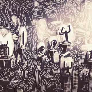
Unexpectedly, the Guild Design Fair turned out to be the firm favourite of all the expositions in town. Southern Guild, the organisers, upped their game. Some of the works weren’t simply displayed in clinical white stands, they were embedded in artful compositions and structures. Put plainly: they were installations rather than dry displays that enhanced the objects and highlighted the aesthetics of them. The best example of this was Conrad Botes’s stand, which was covered in his distinctive cartoon-pop motifs. It was a little Keith Haring-meets Die Antwoord-meets-Roger Ballen but it had impact – it extended his art beyond being an object-based thing.
If ever you needed proof that art and design worlds have not only collided but melded, then a display of objects designed by Kendell Geers, who was once the so-called enfant terrible of the South African art world, would convince you of this. His objects were Gothic-like. A light stand that boasted the disembodied torso of a man holding lights brought medieval torture chambers to mind. A chair fashioned from tyres that were grouped to appear like a snake evoked a macabre fusion of the “necklacing” phenomenon of the country’s violent past with a sort of design that brought to mind Harry Potter, or at least the haunting Voldemort character from that series of books and films.
He was revelling in the aesthetics of violence in a such a way that was uncomfortable - and pleasing, which made it uncomfortable. His preoccupations with the political has become aesthetised, commercialised - its a design motif. Does this mean selling out? The question in itself, as perhaps Sachs was intuiting, is no longer relevant given the art fair phenomenon, where “selling-out” and whatever that may mean now is the norm.You are totally out of the loop if you are not selling your art or derivatives of it.
Given the objects at Guild are high-end design objects that are in limited supply, not quite editioned as artworks are, positions them in the same class as art. You can’t really say what they are; some are functional, others, like Sipho Mabona’s glass panes are not quite (I heard they were made out of sugar). And given art museums treat design objects, like the Moma show in New York presenting Bjork’s work and clothing shortly, like art, the tools to measure and present them have to become more sophisticated – something Southern Guild are slowly grasping. The objects at Guild sit in a precarious place; they are so ambiguous that the organisers are still learning how to present them.
Except for the Artisan by Watershed display, which was a little weak and overpriced, Guild has improved and delivered on unique visual spectacles. Though, of course, some of the international collaborations are troubling – such as the Dutch-based designer working with or “translating” a Swazi aesthetic, which has echoes of the form of appropriation that defined the primitivist turn in European art and design that propelled the modernist movement. An international flavour permeates everything at this fair. Are these collaborations between Africans and Europeans about real exchange between designers and crafters, or does it affirm old power relations, with the international artist uplifting the status of the African's work? The “baboon” effigy used for statues for prize winners certainly got some hot under the collar. Whatever the truth is, the results are seductive.
 |
| Conrad Botes installation at Guild Pic by Mary Corrigall |
As a colleague observed about Guild: “There is so much more here to photograph.” And certainly, Instagram feeds were buzzing with images of the quirky, fantasy animals fashioned from beads that were installed in gardens that appeared to contain real grass. Naturally, it was the work of the Haas Brothers (created with South Africa’s Monkeybiz beading company) who are fixated with melding animals and furniture pieces – truly domesticated pets. It brought to mind the installations at Kemang wa Lehulare’s solo exhibition at the Stevenson Gallery in Cape Town, which presented porcelain dogs gathered around antique suitcases full of earth where fresh grass appeared to be growing. The two works are probably superficially related, visually that is: animals, gardens; the animal immortalised and brought to life by the garden setting. Like a zoo.
These various expositions had somewhat of a zoo feeling; in that you pay a fee to enter, you view exotic species (rare art and design objects) in artificial renditions of their natural habitat – art in a makeshift gallery spaces with white walls, once-off design objects in designer environments that complement them – and these events are all about looking, browsing. As such, social media tools such as Instagram become the indispensable tool in engaging in this activity and whether a work is Instagramable or not becomes the measure of its “success” in this area. In this way the real displays of these expositions are virtual, to some degree.
There was little at the CTAF that was Instagramable, except perhaps for Ed Young’s installation: a large photograph of the artist sitting on a street corner, which was propped up against a wall and surrounded by cardboard boxes and some coins scattered about, as if he was a beggar. It was a cheeky work (isn’t his work always) that wryly referenced the fair, the artist’s position within it. Remarkably, it appeared to be one of the only works at the fair that was intended for the fair.
Art-Fair-art might be a dreadful phenomenon to contemplate but given the Guild displays and their efforts to not only contextualise the works, enhance them and turn stands into immersive visual spectacles, art that responds to and exploits the art fair setting would be interesting – except of course for the fact people might not want to own art that might be meaningless outside a fair context. In the white cube gallery space, art stands on its own ground, at a fair it becomes overshadowed by the context or struggles to assert its own identity – the gallery becomes the signifying identity.
Thing is the CTAF held no surprises. Given the exposition traffic surrounding it, it needs to sell itself harder. As do the That Art Fair, which was also slightly disappointing – it was promised to be a space where popular culture and art could meet – a display of Zapiro’s and other comic art might have been an effort in this regard, except for Zapiro being an established voice. Where was the video-art or performance and fashion?
It may take time for That Art Fair and the other expositions to grow into the events they aspire to be. Perhaps the golden age of African art and culture has yet to arrive. The fact that most of these expositions are driven by white people and promote the work of mostly white artists suggests that they are not quite representative of our culture, our “moment”, which might not have such a strong aesthetic quality that can be packaged and sold to the rest of the world.
Nevertheless there were those in town who believe that the contemporary African art race is on. Certainly, this is the opinion of Herman Steyn of the newly established Scheryn Art Collectors Fund. There is still a chance to buy African art cheaply enough to turn a good profit on it, he asserted at an intimate dinner hosted by Elana Brundyn of Brundyn + gallery. The Scheryn Fund is apparently not just out to make a buck – it was announced that they have made a hefty donation to Zeitz Mocca (according to Mark Coetzee, director at Zeitz Mocca). And, of course, when Zeitz Mocca eventually opens its doors, the exposition scene will have even more competition.These fairs are forerunners of the Zeitz Mocca, which mostly has been devised to cater for an international audience. It may be founded by a German, but it too is intended to prove to the world that African art has arrived.